One of the best compliments we receive is when skilled DIY-ers reach out to us: they understand design, construction, and complexity, and know when it’s time to call in the experts. It makes for a creative, collaborative partnership. So we were thrilled when an experienced DIY couple in Minneapolis’ Armatage neighborhood asked us to design their kitchen in line with the Midcentury Modern style of their home.
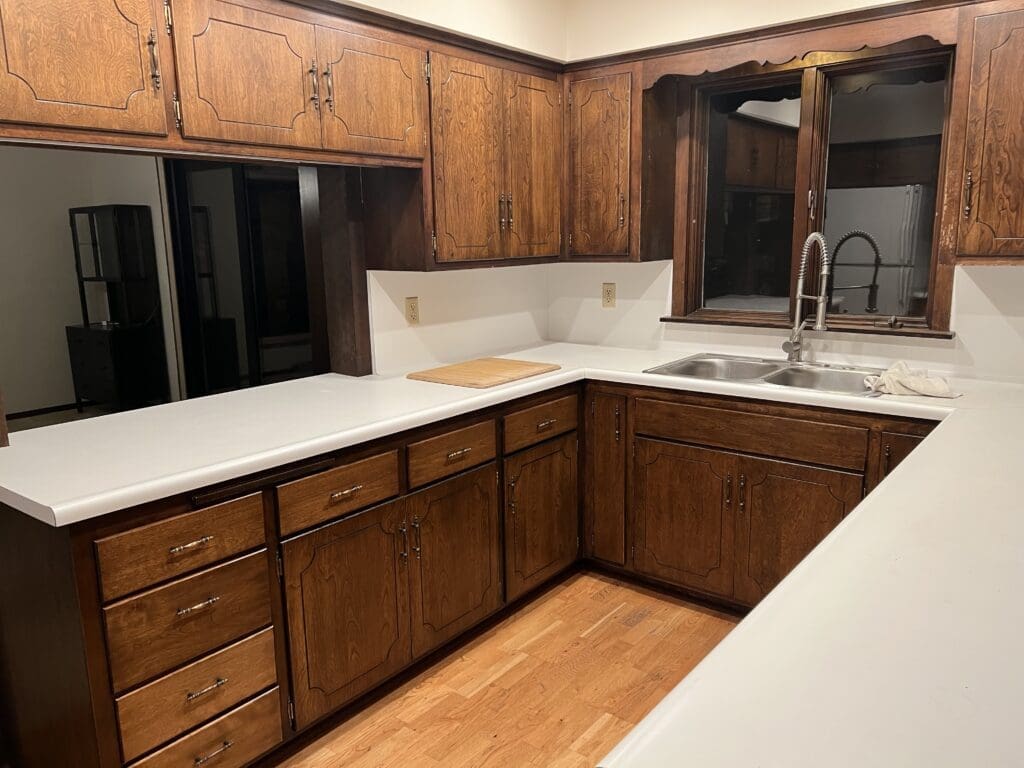
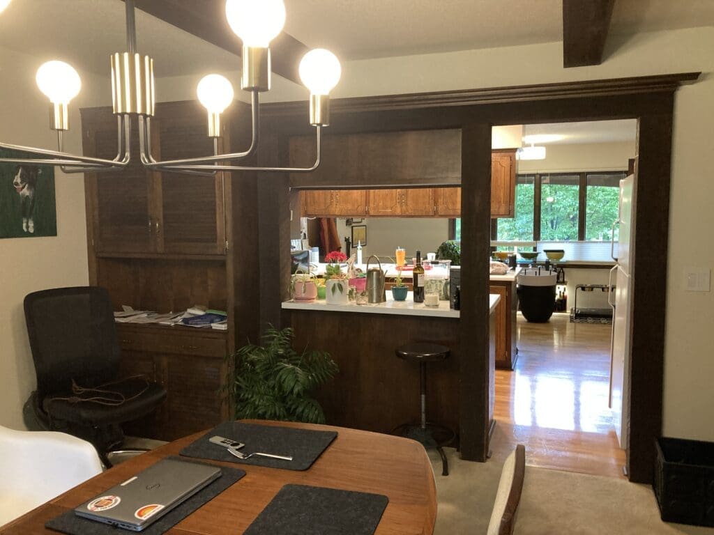
They had already tackled guest bedrooms, transformed the basement into a gleaming bar, and were starting work on landscape design when we came onboard. Against all that beautiful work the clients had done, the kitchen stood out (and not in a good way): dated, in need of expert space planning, and desperately out of step with the rest of the home’s elevated Midcentury design.
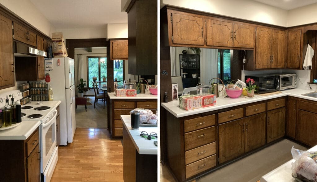
While the kitchen had plenty of square footage, it was inefficiently configured, creating a frustrating combination of unnecessarily cramped workspaces, and wide open, underutilized drop zones. It also had not one, but TWO entrances to the garage, and blocked sight lines in every direction.
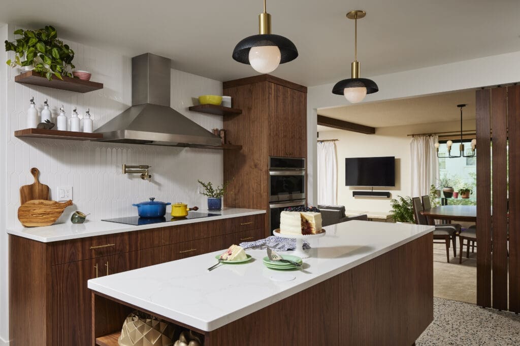
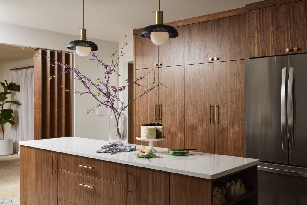
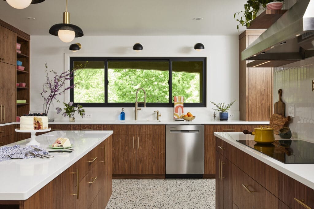
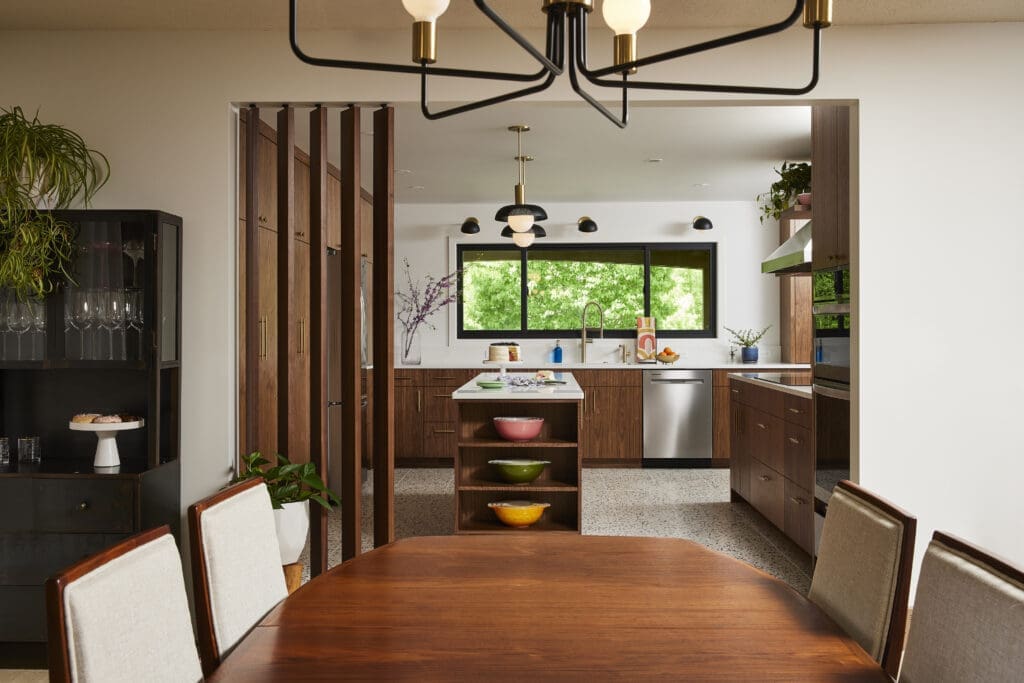
Step one was to open everything up so that the kitchen could breathe. We removed excess soffits, expanded the opening to the dining & living rooms, and oriented a large custom island lengthwise to promote easy flow and circulation.
We removed the bulky upper cabinets that bisected the original footprint to create uninterrupted sight lines.
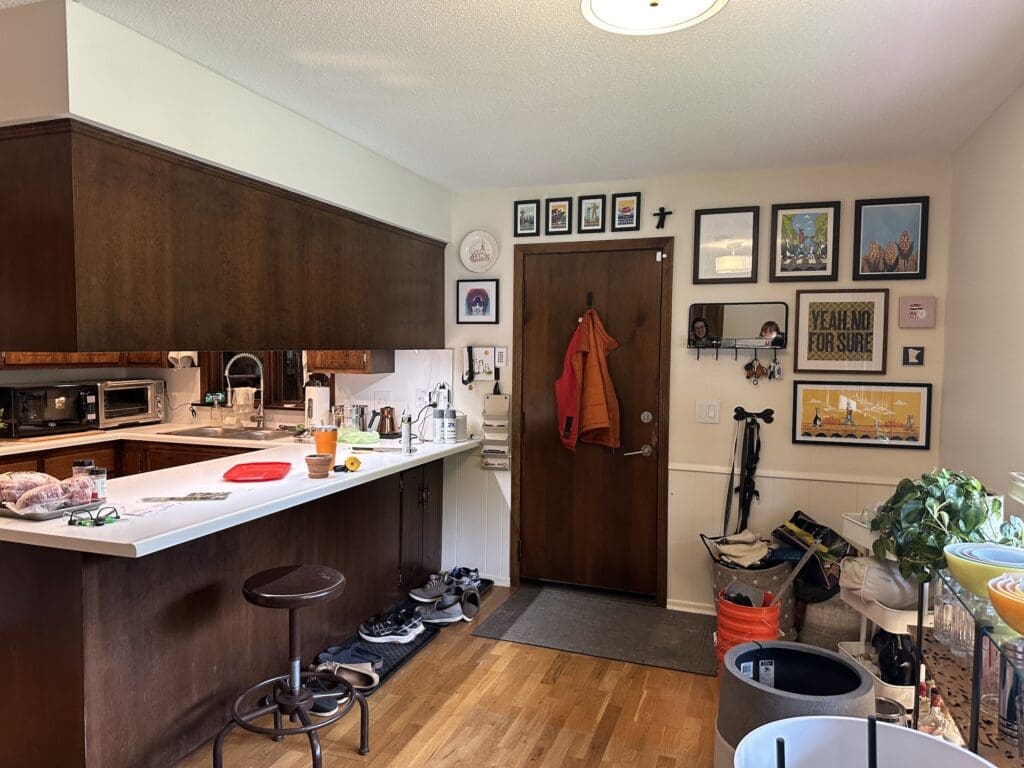
The strange over-sink window that looked out onto the enclosed porch and garage hallway transformed into a functional mudroom entrance…
…and the cramped, U-shape workspace unfurled into a spacious pantry wall.
By closing up the second entrance to the garage, we were able to extend the pantry wall farther, providing ample storage and rescuing the clients’ small appliances from the entryway coat closet where they’d been relegated.
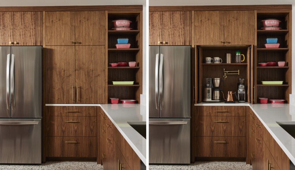
This also gave us display space for the clients’ vintage Pyrex collection, and enabled us to create the dreamiest hidden coffee bar, complete with its own pot filler!
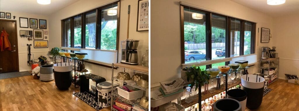
Before, this side of the kitchen was a combination of make-it-work temporary storage solutions and a neglected view.
By integrating the wall into the cohesive footprint of the kitchen and relocating the sink and dishwasher along it, we exchanged the clients’ back hallway “view” for a dishwashing station with a fabulous view outside.
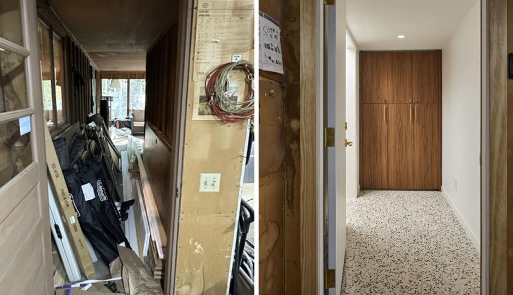
And speaking of that back hallway “view,” she got a glow-up too, and now the walk from the garage is no longer an eyesore.
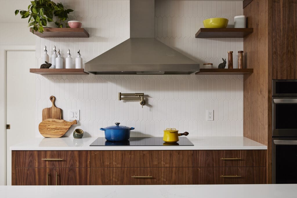
Our clients wanted the kitchen to reflect the age and Midcentury style of the home, and materiality is where the magic happened: custom walnut slab-front cabinets, brass hardware in Midcentury forms, elongated picket tile backsplash, and terrazzo tile flooring all came together to create the perfect Midcentury moment.
We could have stopped there, but we wanted to add something a little extra juicy and push the Midcentury design further. Here are two of our favorite details:
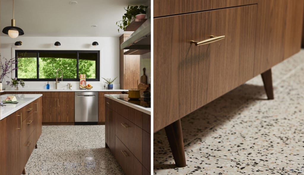
We elevated the kitchen island (literally) on furniture-like feet to both bring in more spaciousness and to nod to our favorite Midcentury Modern furniture designers.
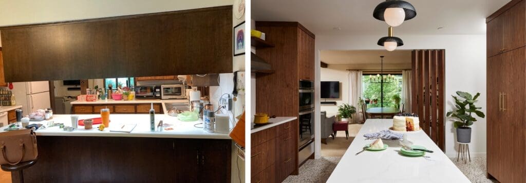
We also took advantage of the newly-expanded entrance between the kitchen and dining room to add extra detailing. Now the entry way is no longer dark and cramped…
…but bright, open, and accented by stunning walnut dividers that define and provide transition between the two spaces.
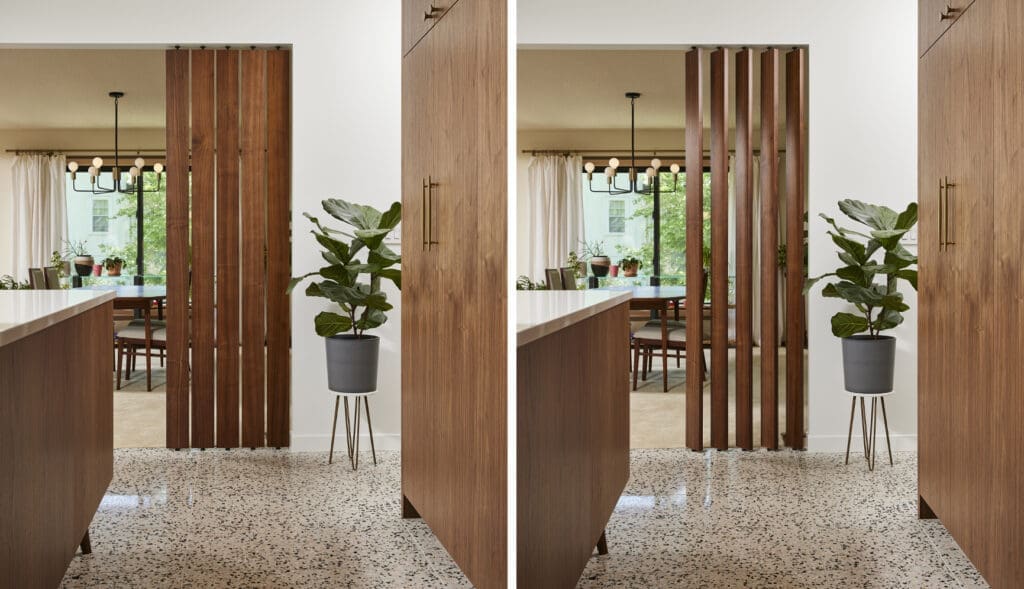
The best part? They’re louvered, providing interest and the flexibility to respond to the mood.
No longer an awkward outsider in her own home, this kitchen is now the Midcentury stunner she was always meant to be: open, expansive, and ready for the holiday hosting season!