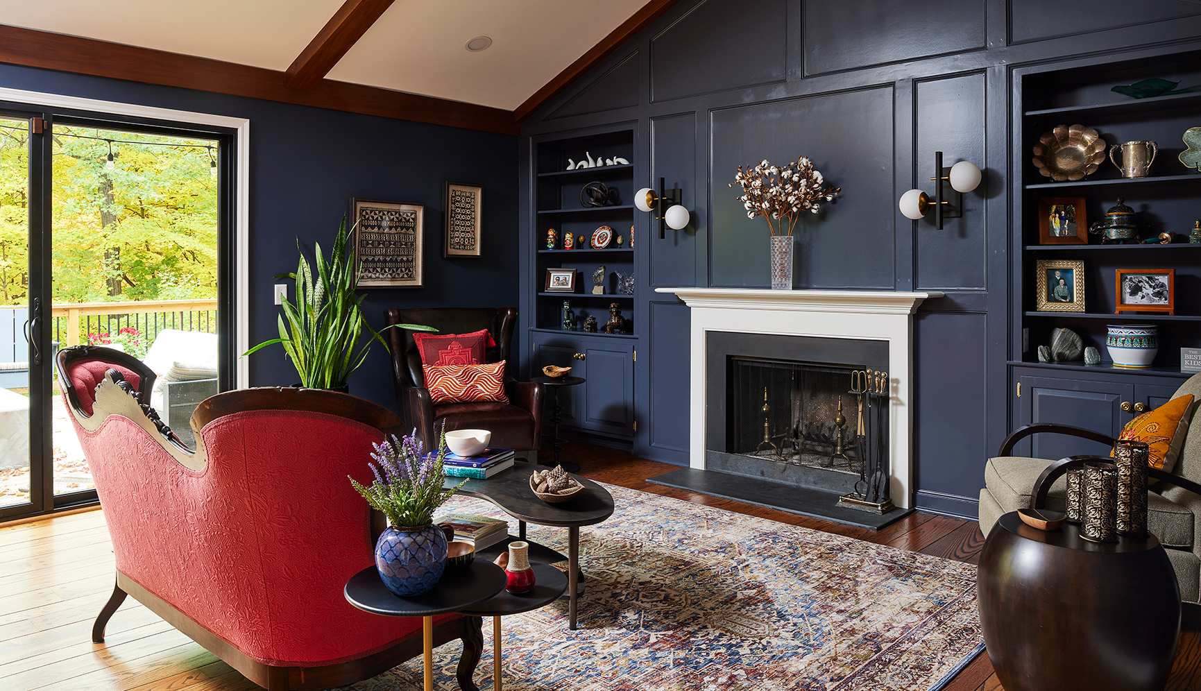
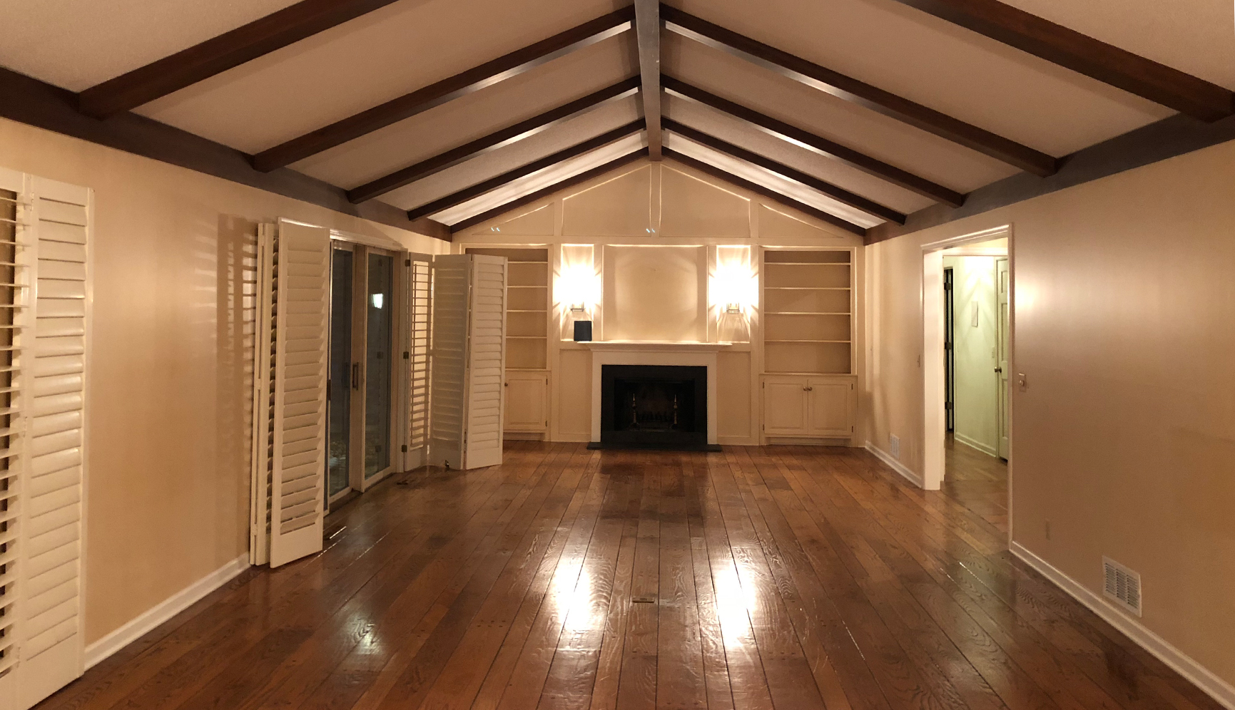
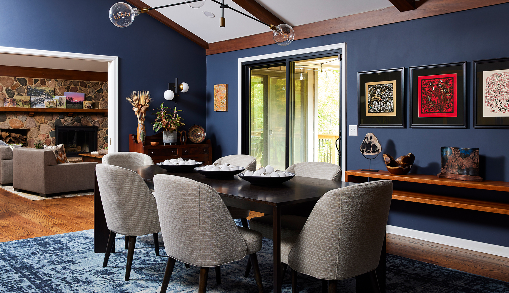
Woodland Modern Aerie
Project Details
Remodel Type: Multiple Rooms including Kitchen, Primary Bathroom, Guest Bathrooms, Den, Dining Room, Living Room, Hallway, and Entry
Design Style: Transitional
Trade Resources and Partners
Photography: Alyssa Lee
Contractor: Urban Refurbishment
From the Client
We’ve done several large home remodel projects with Colleen.
Colleen’s eye for color, her network of suppliers, her creativity and ideas, and her impressive technical lighting knowledge were all instrumental to the success of our project. We’re delighted with the results and would highly recommend Colleen for any job, big or small.
Before Conditions
-
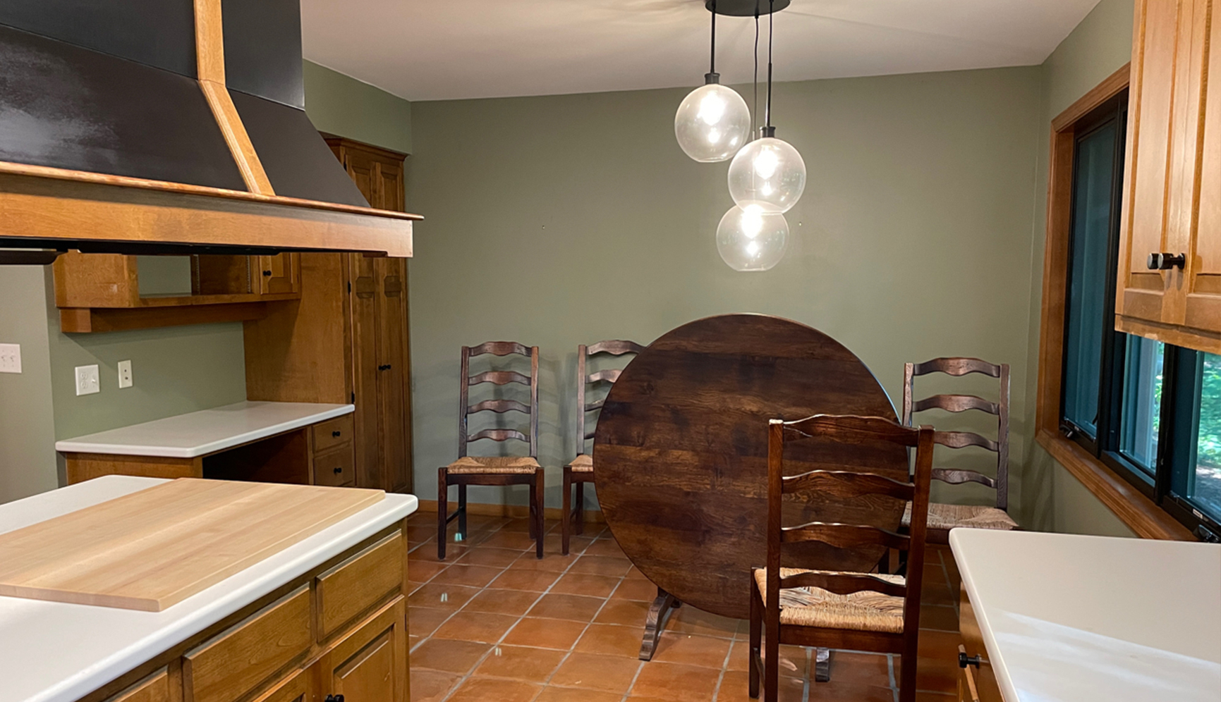
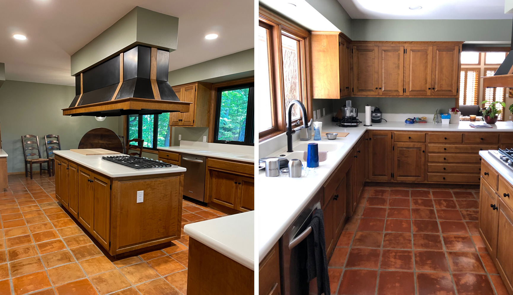
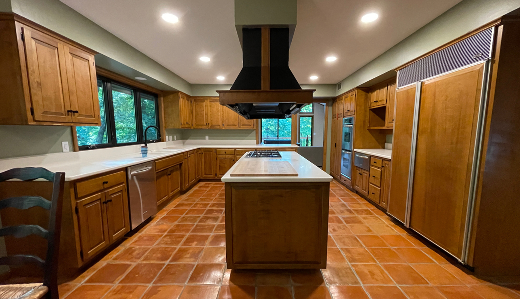
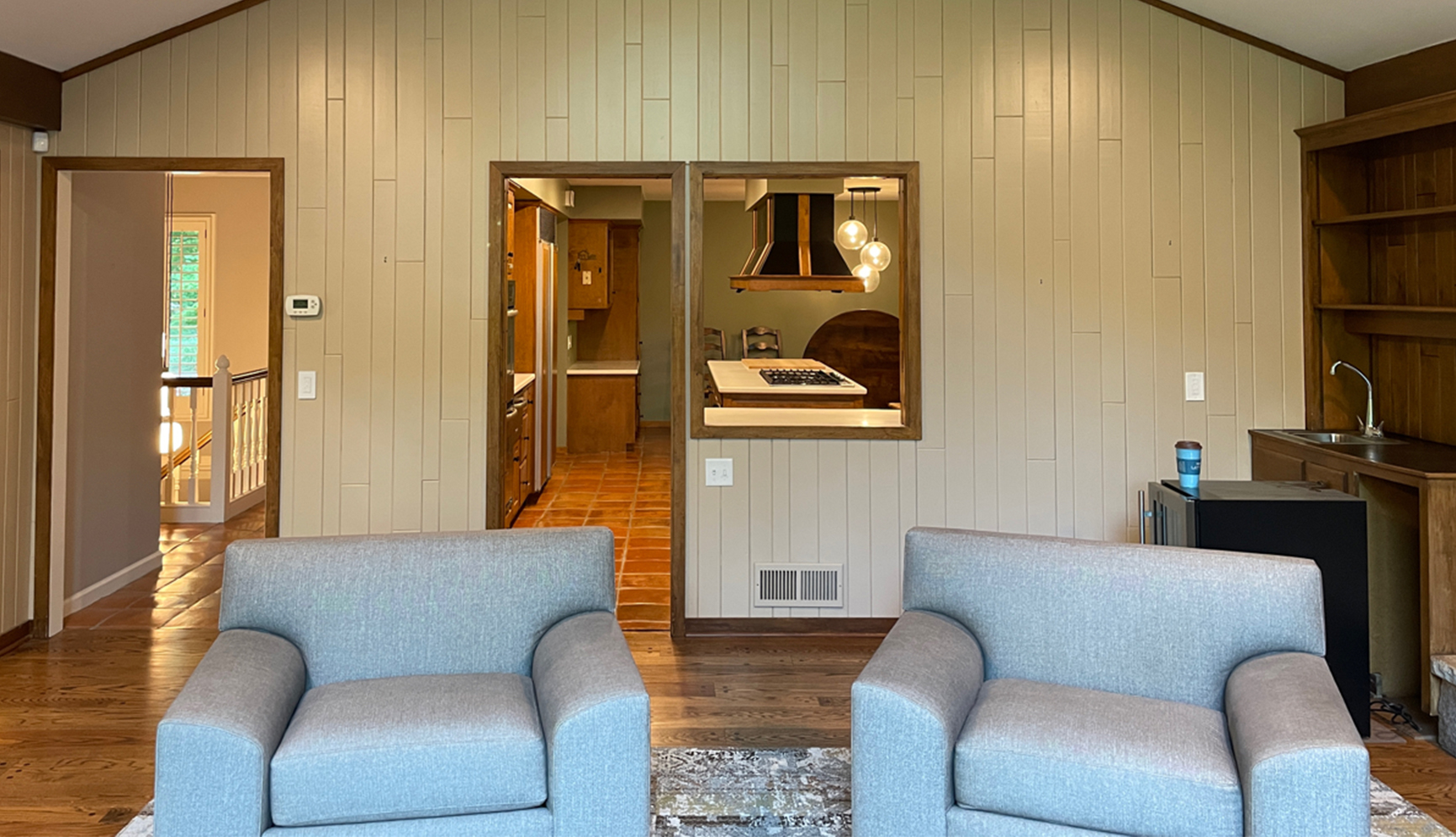
Dark cabinets and laminate counters in the kitchen felt visually heavy
-
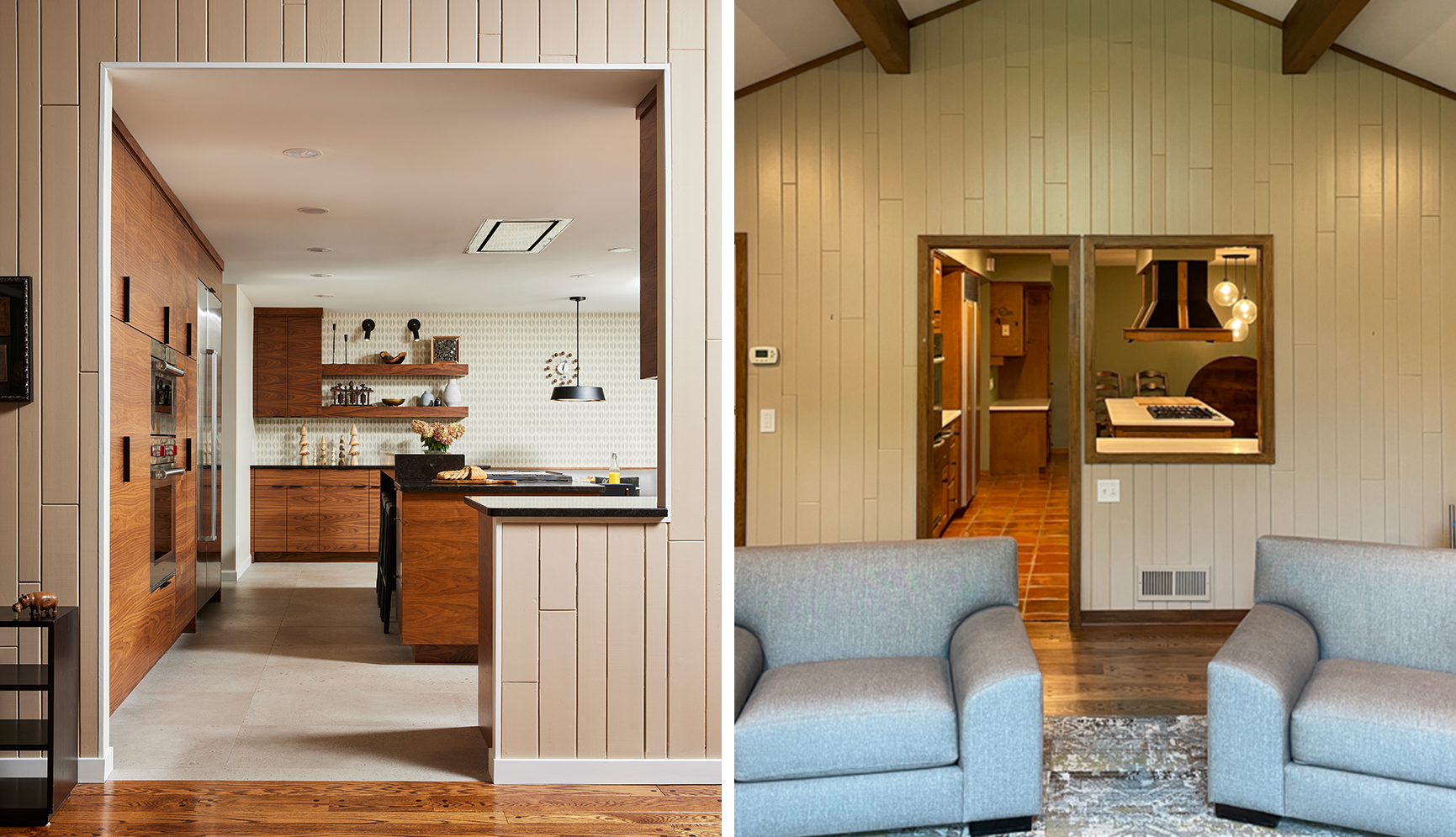
Original 1978 dark wood cabinets, sloped terra cotta tile flooring, solid surface counters, and an imposing 90” x 36” range hood over the island
-
Island had almost no open counter space due to the cooktop and indoor grill (which we had removed previously and filled with a custom cutting board in the short-term until the reno)
-
Closed off from adjacent rooms
Client Objectives
- Introduce neutral, classic modern finishes to fit with updates made throughout the rest of the home.
- Finishes and style preferences: Warm wood tones with attention to grain detailing and a soft color palette in warm grays. No beige or gold like parents’ home!
- Smooth flooring after living with the uneven and sloped surface of the original terracotta tiles since 2019 that made walking around the house uncomfortable
- Widen passageways to the den and back hallway, functional work zones with easy access between range, MW and ovens during cooking.
- Liked their Sub-Zero and ready for a new modern model
- Premium cooking appliances
- Get rid of the giant vent hood that was a head basher. They were looking forward to seeing it demolished and even joked about skipping work to swing the sledgehammer.
- Plenty of storage
- Seating for everyday casual meals with easy access to outlets for working on their laptops (we placed the sillite outlets around the banquette based on the power cord location on his laptop & his ideal spot to sit in – i.e. right side of his body)
Design Solutions
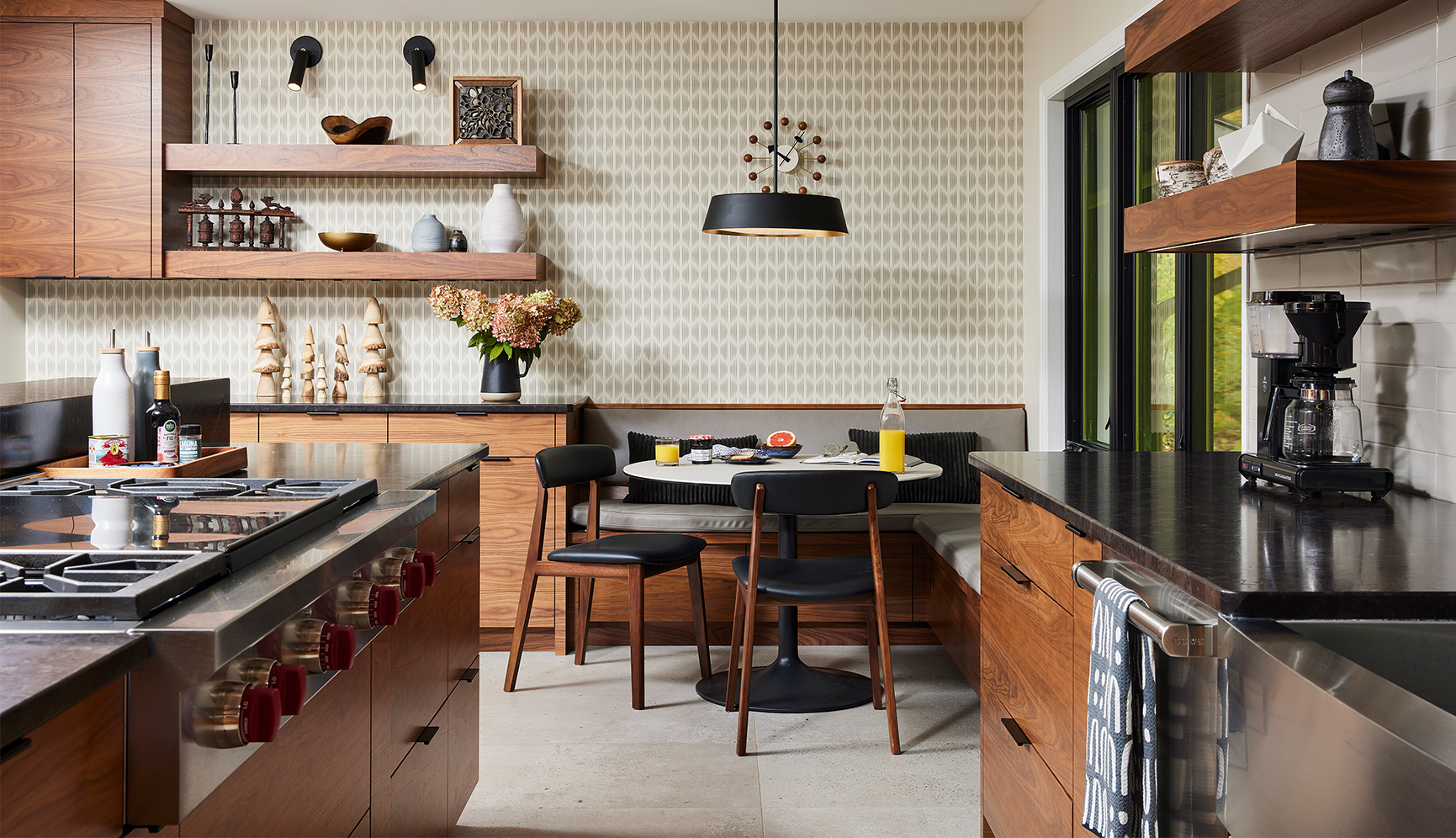
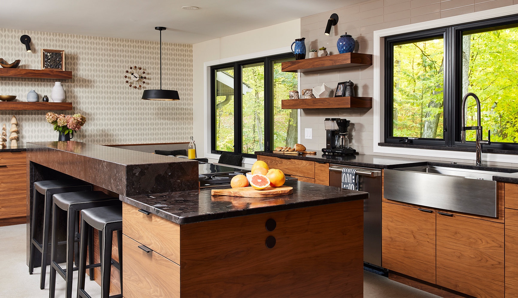
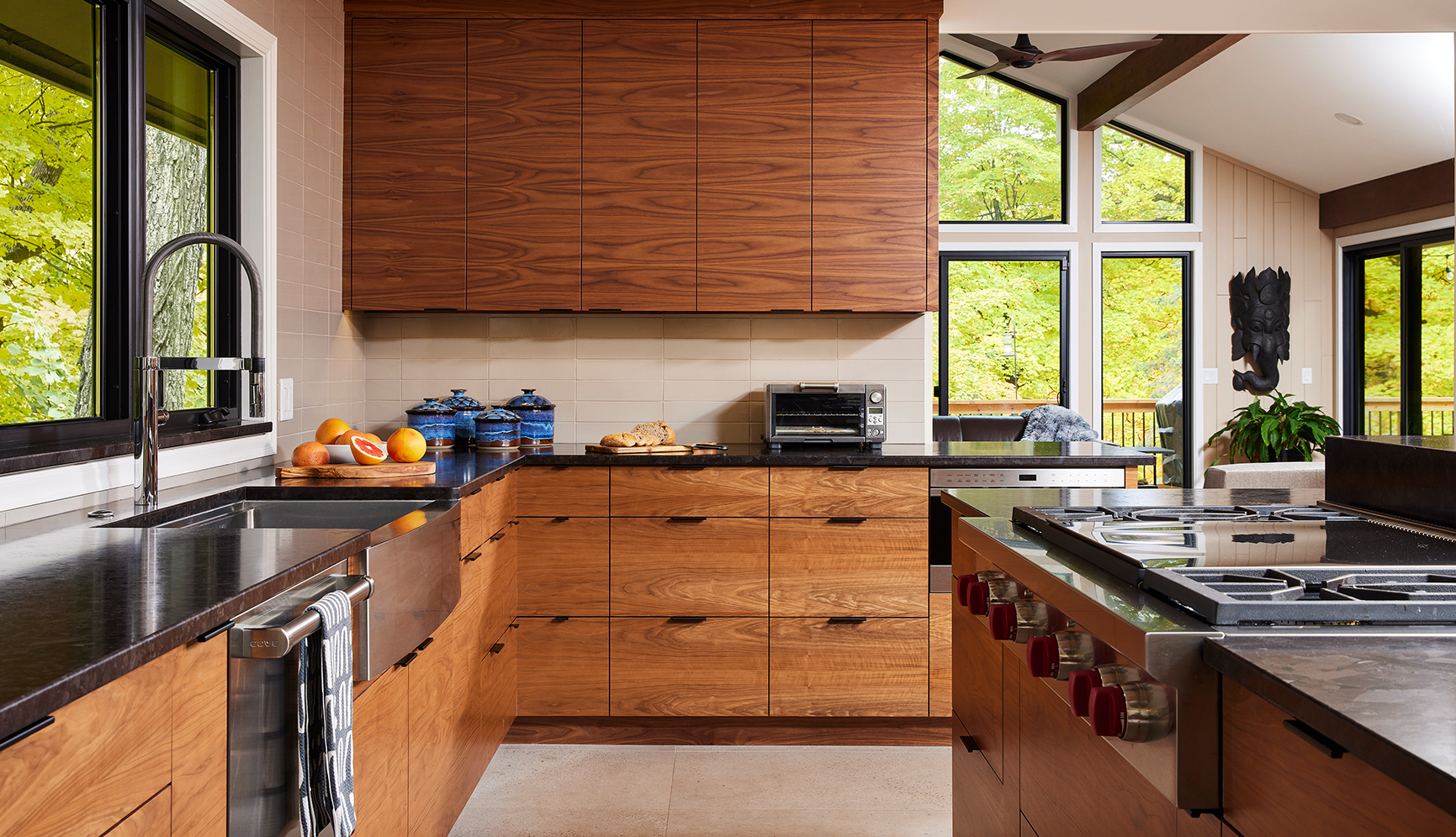
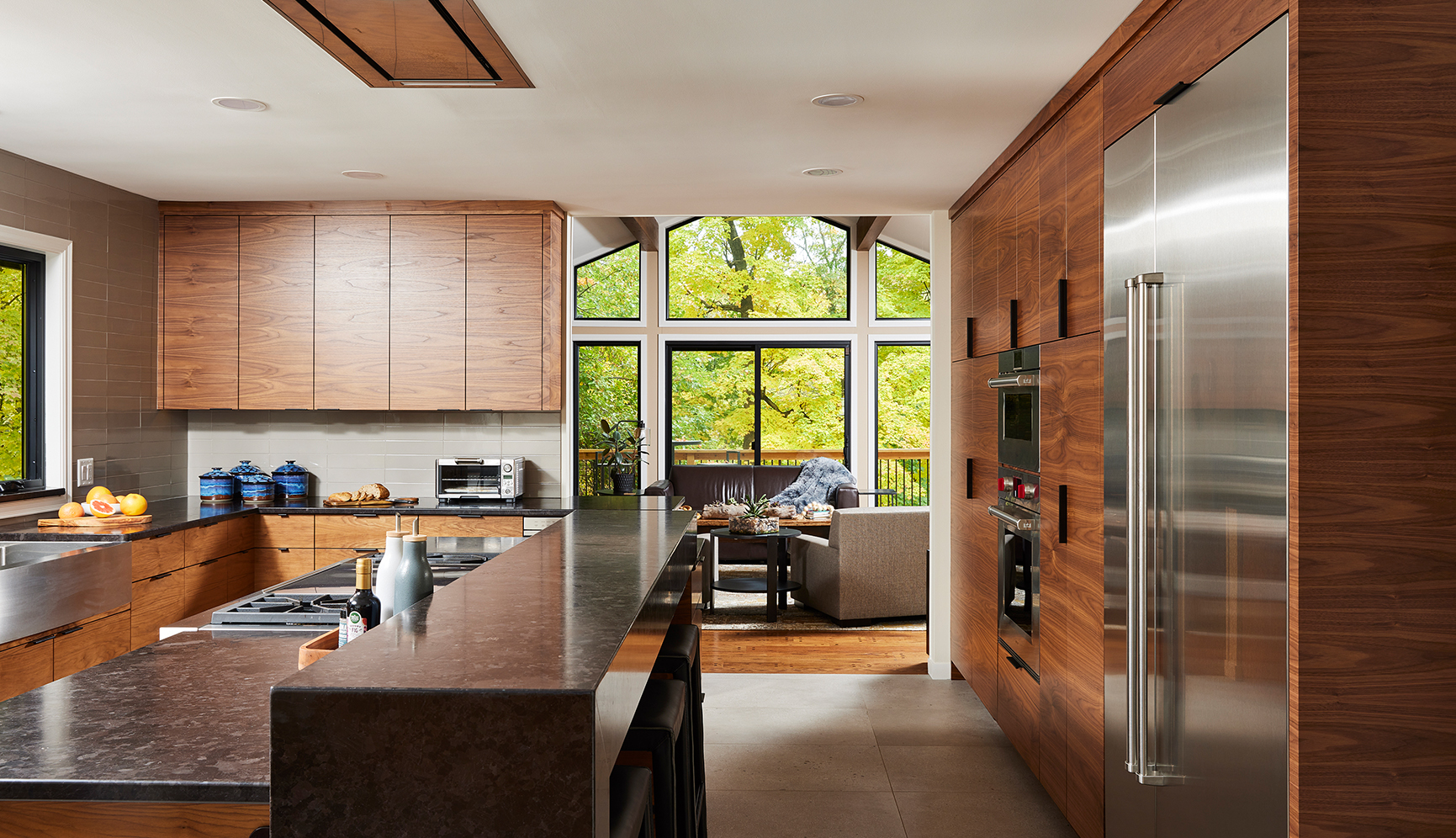
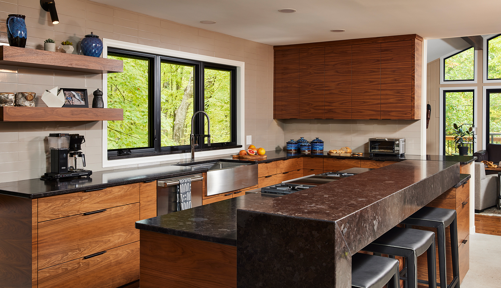
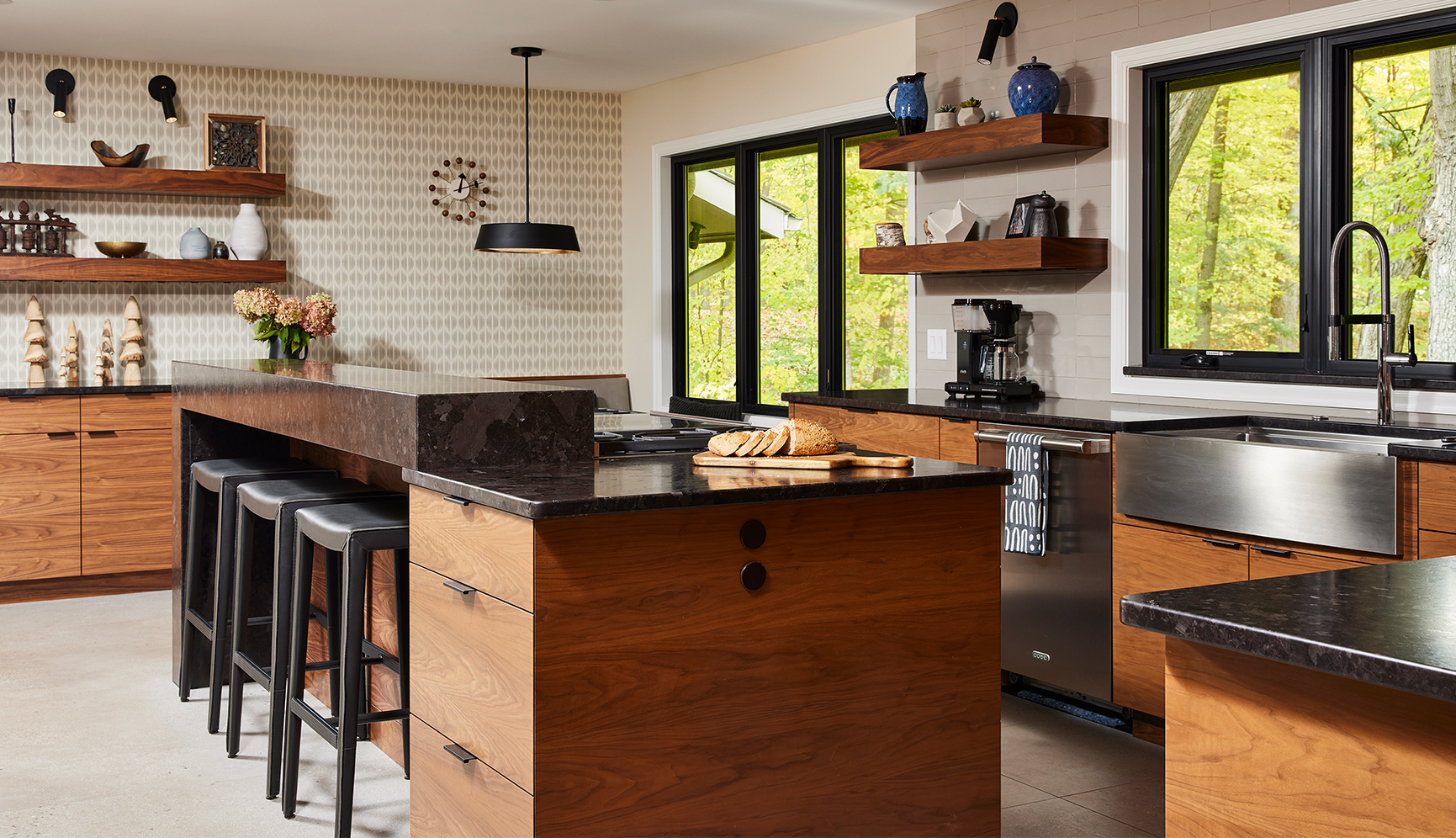
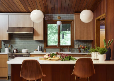
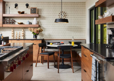
- Finishes palette implemented: Walnut horizontal grain book matched cabinetry, granite counters, warm greige ceramic tile backsplash, 24×48” gray floor tile with a subtle pebbled movement reminiscent of concrete or the north shore, wallpaper accent wall.
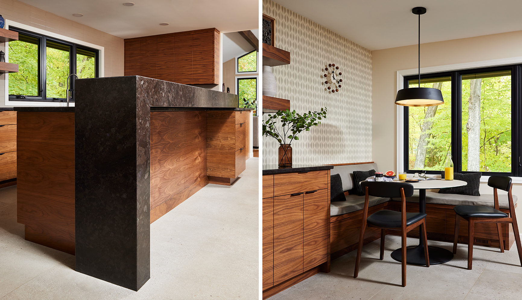
- 6” Mitered raised bar counter with waterfall end provides visual break as well as a perch for guests while the chef is cooking (custom steel supports)
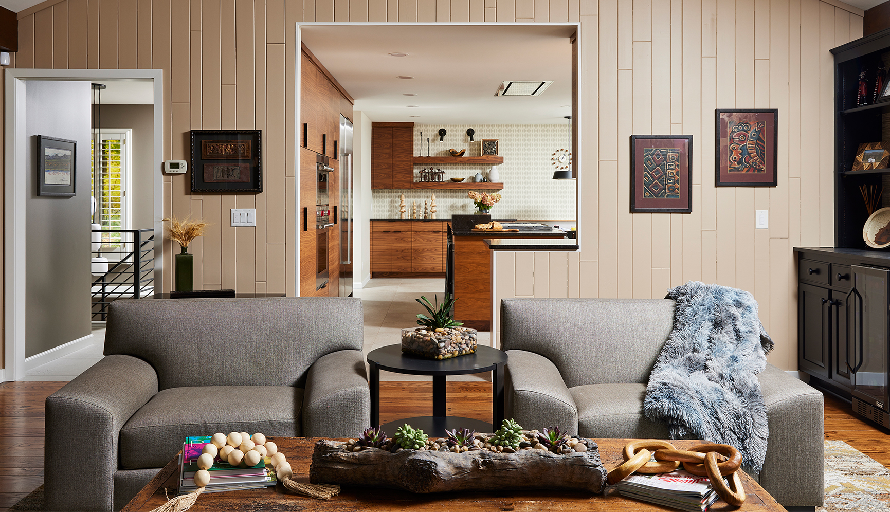
- Changes made to layout to improve the flow: Widened and raised the opening to the den, bringing in more light and improving circulation.
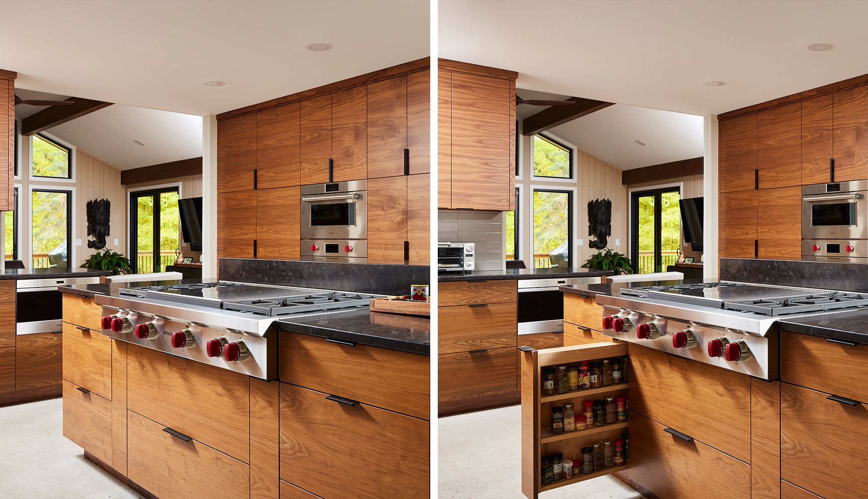
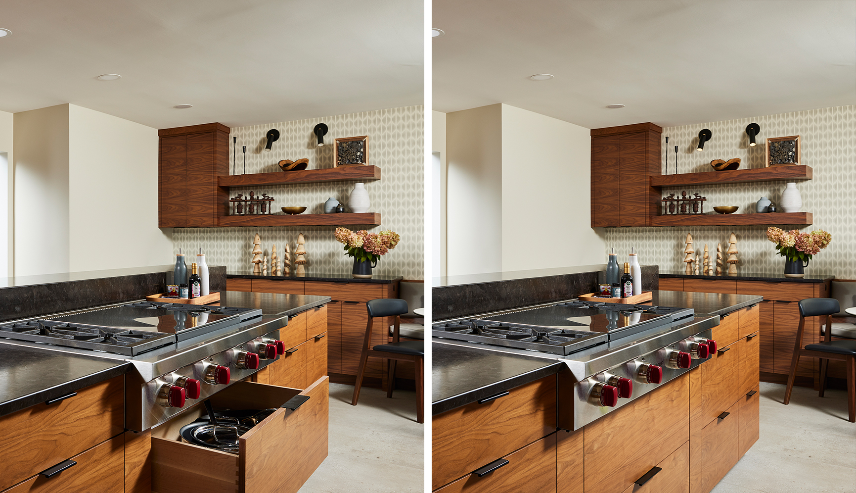
- Integrated new cooking station with 48” range top with wide drawers below for pots & pans, and pullout cabinets on either side for easy access to spices & oils. MW drawer and ovens within easy reach.
- New vent hood flush in the ceiling opened up sight lines, and removed the daily pain point of hitting their head every time they cooked.
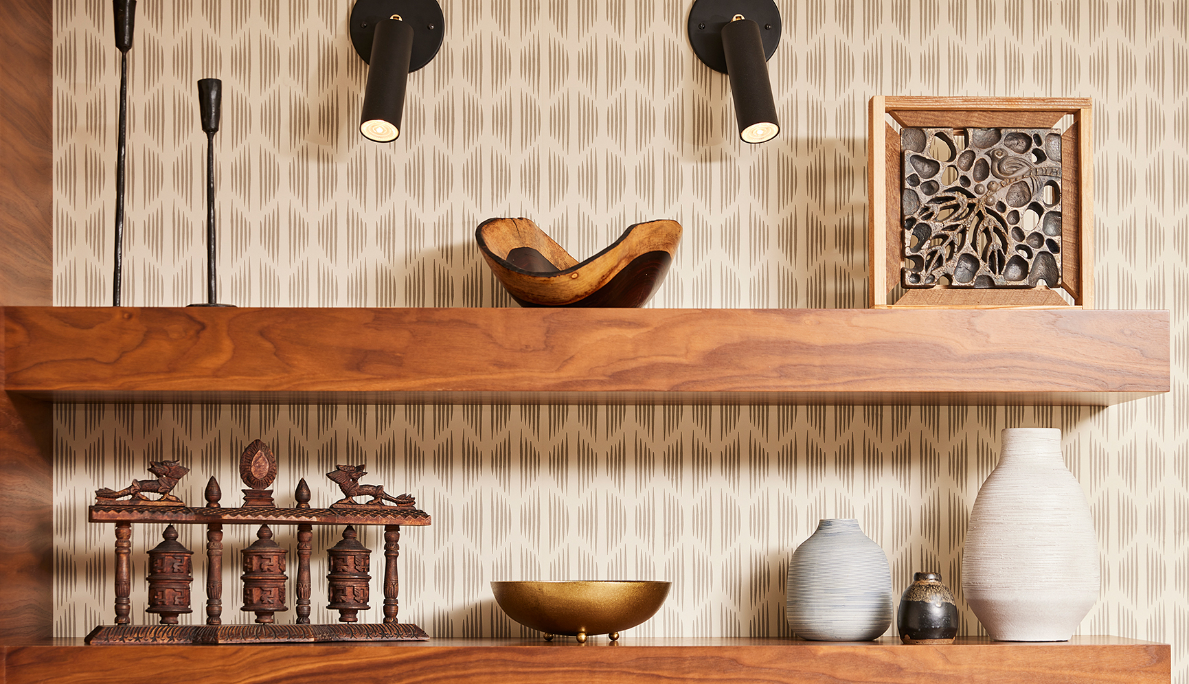
- Utilized the (previously underutilized) north end of the kitchen with a new banquette and sideboard with floating shelves for objects from their travel adventures.
The Details That Make It Work
-
They love sitting at the banquette with the newspaper in the morning or with their laptops while working remotely.
- CABINETRY:
-
- Horizontal grain walnut, book matched, custom layout to ensure the flow of grain across each run of cabinetry.
- Grain direction repeated even on the face of end panels.
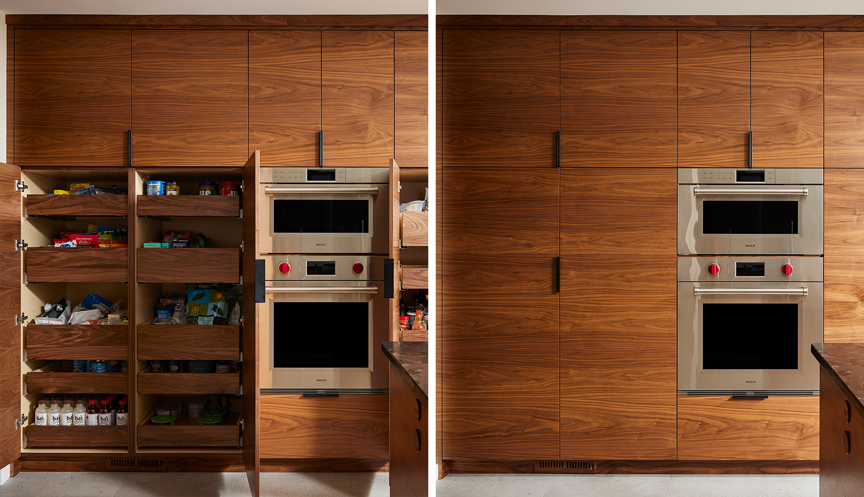
- Face of interior rollouts in walnut so that the wood color would match the doors when visible through the tiny gap between doors due to the edge pull door hardware.
- Island end panels and end drawer faces mitered to create a continuous grain wrapping around the island without a visible end panel front edge.
- LED and plugmold recessed flush into the underside of floating shelves.
-
- Schumacher wallpaper brings texture and pattern to the quiet palette
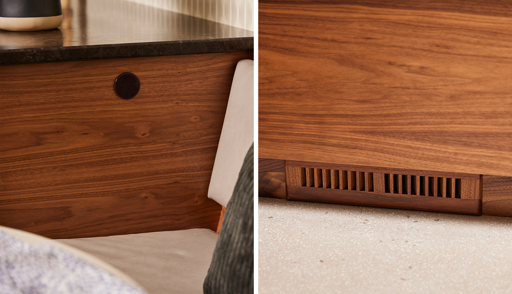
- Sillite (round) outlets integrated into end panels on island and sideboard to blend into the walnut and not distract with a large outlet cover plate
- Adjustable height roll-outs in the sideboard allow for large dog food containers
- Pantry roll-outs are specifically laid out with height spacing for their specific pantry items (ex. Heights for canned goods vs cereal vs jars of nuts determined and then configuration set based on optimal layout)
- Bread drawer, corner drawer unit, pull-out for cookie sheets and cutting boards right where food prep happens
Project Details
Remodel Type: Multiple Rooms including Kitchen, Primary Bathroom, Guest Bathrooms, Den, Dining Room, Living Room, Hallway, and Entry
Design Style: Transitional
Trade Resources and Partners
Photography: Alyssa Lee Photography
Contractor: Urban Refurbishment
From the Client
We’ve done several large home remodel projects with Colleen.
Colleen’s eye for color, her network of suppliers, her creativity and ideas, and her impressive technical lighting knowledge were all instrumental to the success of our project. We’re delighted with the results and would highly recommend Colleen for any job, big or small.
About Colleen
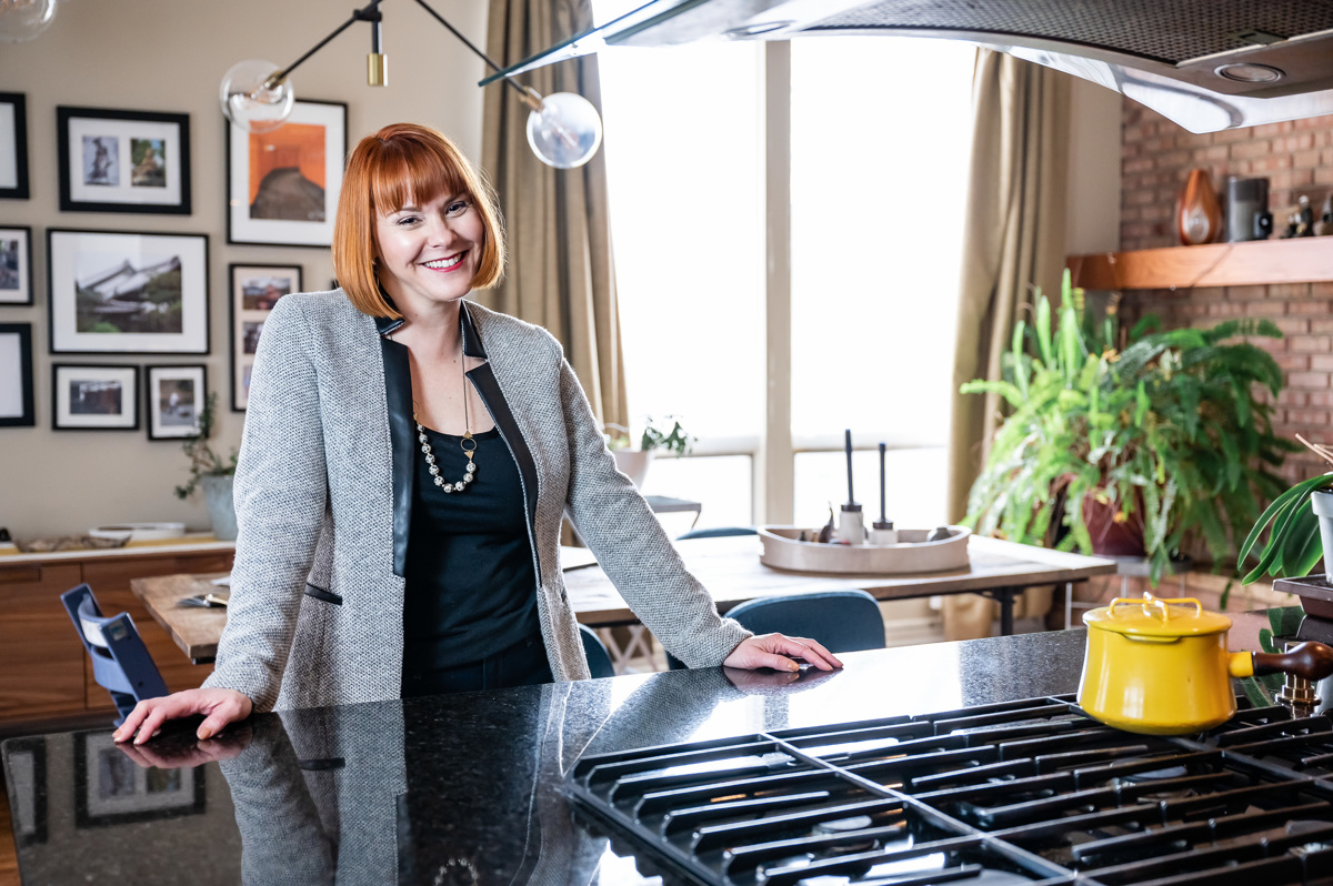
I live in Minneapolis with my landscape architect/urban designer husband, my volleyball & Taylor Swift loving daughter who believes she’s my design assistant, an independent Siamese, a feisty grey-striped kitten, and a menagerie of turkeys and other wild animals who visit our backyard for the free food. When I’m not designing, you’ll often find me cooking up a Paleo feast, cheering for my daughter's volleyball team, playing pickleball, or hiding in a corner with my nose in a book.
